Apparently the Vauxhall Cross ziggurat that currently houses the Secret Intelligence Service is an example of the style (you might have seen it in a James Bond flick, if nowhere else).
This is a small exhibition, but quietly fascinating - not because of any great reveals to me, but some of the conceptual designs and art displayed, along with models of the buildings in question. The most impactful stuff was by a chap called John Outram (there's an interview here).
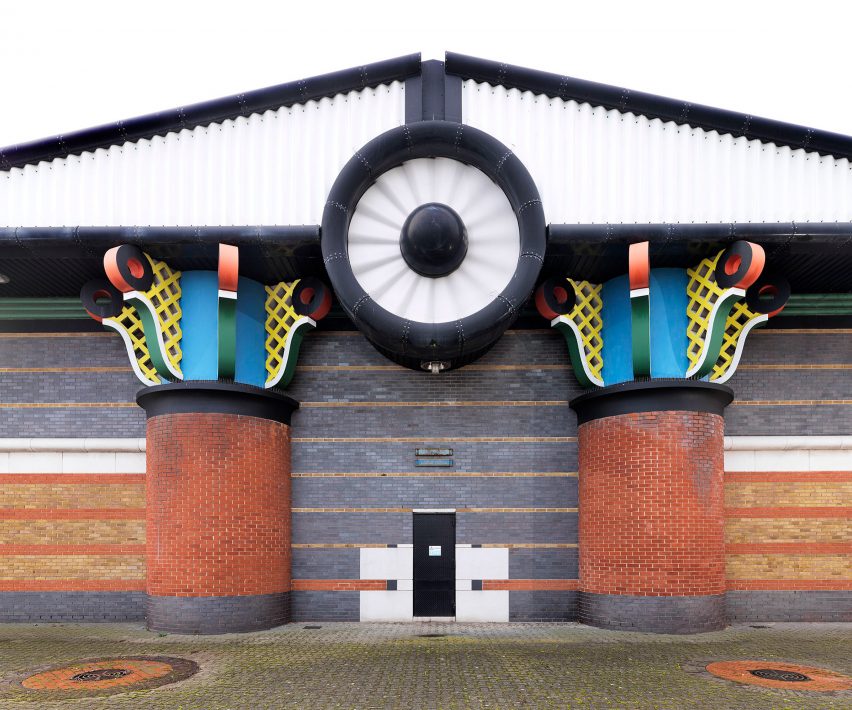
He did a pumping station in the Isle of Dogs that looks like this:
 |
| Those capitals are a bit much, really. |
The pumping station is thought well enough of by certain of the powers that be that it has been listed. Not something that appeals to me, but some of Outram's other stuff is interesting. The Judge Business School in Cambridge, for instance.
| https://en.wikipedia.org/wiki/Cambridge_Judge_Business_School#/media/File:Judge_Business_School_Cambridge.JPG |
Or his design for 200 Queen Victoria Street. But for the best...
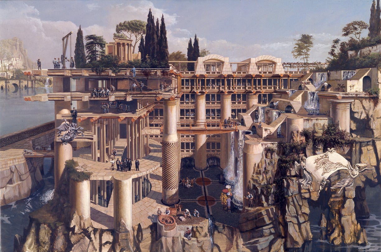
This painting, by Carl Laubin is an interpretation of Outram's design for a new building for the Financial Times:
 |
| Carl Laubin, Imago Terrarium, 1987. http://www.carllaubin.com/album/capricci.html#40 I should open it in a new tab to see it in the largest size possible. |
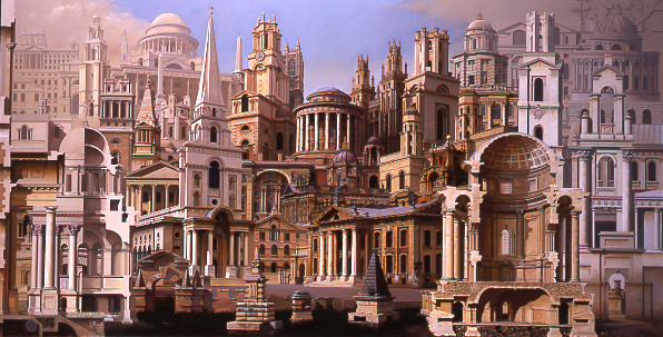
It is something, is it not? The Thames-flooded Middlesex around it, cypresses atop the ruins that serves as a cutaway diagram, the archeologists uncovering side by side with the builders raising it up. Laubin has done some other fun stuff, cramming architecture together like a Dark Souls map (not that I know a thing about that game).
 |
| Carl Laubin, Hawksmoor, 1996-2000, http://www.carllaubin.com/album/capricci.html#21 |
I think both Outram and Laubin have a notion of a place in history for buildings, which I like. The obsession with ruins and the OSR has been noted, of course (there is even a comment about Sir John Soane as a patron and art of how the Bank of England will look, centuries from now when it is ruined....)
***
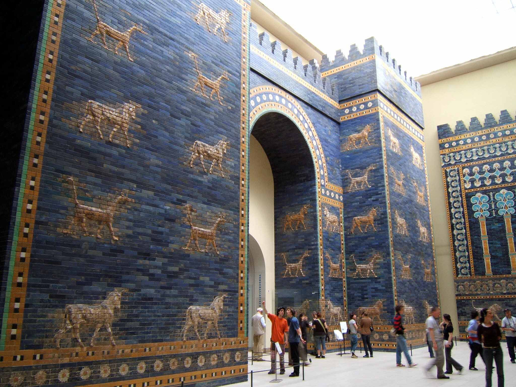
What use do I intend to make of this, however? Well, Outram's stuff all has a rather ancient Near/Middle East feel to it. Those aren't Grecian columns in the ruins above (he has even done some specifically Egyptian themed stuff). The bright colours also rather point me towards Babylon: see the blue tile of the Ishtar Gate.
 |
| A reconstruction in Berlin. Doubtless the Punth equivalent depicts Qryth fang-lizards or Behemoth-bests rather than oxen and dragons. |
So, a notion of Qryth architecture: when first made, the ziggurats, mansions, walls, &c. were all marvellously parti-coloured and bright - either because that was what the Qryth had, or just how their grand earthmovers and building machines dealt with strange materials. Now, however, the strange coloured panels are cracked, spalled and dusty. Later buildings imitate these in tile and brick (or tapestries, wall cloths or banners for interiors), but are never quite as vivid in tone as the Qryth originals.
This now is Punth: Orwellian four-armed green giants clutching half-functional ray-guns in dusty funhouse vastnesses and a brainwashed populous outside...
There's a joke about colour and the pink paper that I missed somewhere.
ReplyDelete